App 1: Parcels and Street Centerlines Viewer
This web app offers a side-by-side map of Delaware County’s parcel data and street centerlines, allowing users to explore the layout and organization of land and infrastructure. I built this using ArcGIS Experience Builder, which let me create a clean layout with both a map and supplementary visuals, like the Delaware County crest and a vintage map image, to make the experience feel more polished and contextual.
Users can:
- Click on individual parcels to view details like acreage, land use, and ownership
- Select street features to identify road names, highways, and street classifications
- Use the app to explore the spatial relationship between land divisions and the road network
This tool can be helpful for local planners, real estate professionals, or residents curious about land ownership and how streets and parcels intersect across the county.
https://experience.arcgis.com/experience/9e93ee35c4474c41a858e178718ad14a
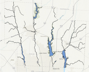
App 2: Delaware County Hydrology Dashboard
The second app is a hydrology dashboard that displays rivers, streams, and water bodies throughout Delaware County. Built using ArcGIS Dashboards, it combines a zoomable map with sidebar visuals and a data box that updates with feature-specific information. Users can either scroll through key hydrologic features or click directly on the map to get more info through pop-ups.
Features include:
- A dynamic map interface showing streams, lakes, and other water features
- A sidebar with notable hydrology images and names
- Attribute details like water feature names and area size
This app would be valuable for environmental planners, educators, or anyone interested in the geography of Delaware’s water systems. It provides a visual reference for where hydrologic features are located and how they are distributed across the landscape.
I could not get the link for this to work as it kept saying that there was a data source error. I tried to troubleshoot, but was not able to get anywhere. Included here is a screenshot of the map part however.