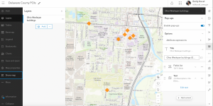
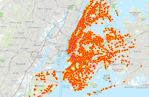
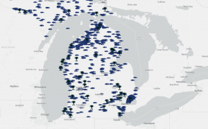
For my first application, I decided to use my idea from chapter four, which was inspired by iNaturalist. I created a Survey123 that allows me to track the population of the invasive species, the Spotted Lanternfly. Here is the general description: This survey is to collect data on the invasive species Spotted Lanternfly (Lycorma delicatula). This species was found in Ohio around 2020 and has been spreading since. There have been multiple invasions spotted around Columbus. If you have found one, this survey will allow you to upload a picture and the location of it. That way, we can track the amount, location, and description of the general area of this invasive species in Delaware, Ohio.
This is the link to the survey: https://arcg.is/1rCinD1
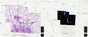
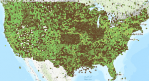
My second application was changed from my original data of creating a 3D map that illustrates the population density of each city in Ohio. Instead, I still went off the idea from chapter 7, but found data on fire detection from NOAA and decided to use that data instead. The 3D map I have created illustrates the number of detected fires spread across North America and Mexico (a tiny bit of Canada was included), and the ecosystem that was affected. Here is the link.