
Month: May 2025

Powell Final
Final Two Apps
For the app based on Chapters 1-4 I created a survey that took a look at the various right of way points in neighborhoods in Delaware. I think this survey could be used to see which areas in Delaware require thing put in place to make a right of way stop easier to navigate such as better crosswalk line visibility.
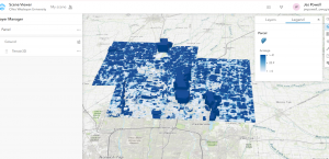
For the app based on Chapters 5-7 I created a simple web scene of the various acres of land in Delaware using the Parcel data from the Delaware Data. This 3D map just shows which parcels have a bigger acreage.
Powell Week 5
Chapter 7
Chapter 7 looked at 3D web scenes and other basic 3D elements of GIS along with some mentions of VR. I found this week to be pretty easy to follow through as in the previous section of this class we took this semester we had done a little bit of 3D work in ARCGIS pro. I really enjoyed creating a web since using feature layers and 3D object symbols and found it overall to be pretty cool. Creating the layout of the park reminded me a lot of the sims which was fun. I feel like this chapter was very similar and familiar to something we had done in GEOG 291 and I found this overall to be very easy to go over.
Fondran Final
Final two applications
1.For my first application I was inspired by the chapter 4 tutorial on Survey123. As I’ve walked around campus, I have noticed that wildlife is abundant in this area. This made me want to create a survey where users could select the wildlife they spotted and put the exact location where it was seen. Users could also select the date it was spotted and even add pictures with their response. This would allow for easier reporting of animals and understanding where they frequent the most. This could be helpful for people who may want to avoid areas with skunks or areas where deer populations are higher, prompting more caution when driving.
https://arcg.is/0zSuzO
2.
This first application leads me into the second, where I’m applying the data from the survey and making it easier for the public to view. Rather than just keeping data for myself, I wanted to create an interface where people could see the real-time data. I used information from chapter 6 tutorials to create a comprehensive dashboard that uses data from my Wildlife Reporting survey. I created data from the survey into a feature layer by making it into a map scene. I then opened up a dashboard and almost exactly followed the tutorials from the book. I ran into a few problems but was able to move past them, creating an informative dashboard. The dashboard includes a gauge to show the number of wild animal sightings in the last 10 days, the 10 most recent sightings and what they were, the frequency of what animals have been spotted over the last month, and also a map with pinpoints of exactly locations. The survey and the dashboard will be published so that everyone can collaborate on it whether or not they’re in our organization.
https://owugis.maps.arcgis.com/home/item.html?id=9a3aaab2f19843edbca04647a2da2220
Data used:
Topographic map of Delaware County from ArcOnline
“Fake” data from the Survey in order to show how the dashboard would look/function
Final Marzulli
For my final project, I used ArcGIS to look at how easy it is for people in Delaware County, Ohio to get to a public park. I wanted to find out how many houses are close enough to a park to walk there, using a half-mile distance. I used data from the Delaware County GIS website and tools from Chapters 1 to 4 to do this.
Data I Used:
- A map of public parks in Delaware County
- A map of roads in the county
- A list of address points (homes)
- Zoning or land use maps if needed
Steps I Took and Tools I Used:
- Adding the Data and Styling It:
- I downloaded the data from the Delaware County GIS Hub and added it to ArcGIS Pro.
- I colored the parks green and added roads and house points on top so everything was easy to see.
- Making Buffers Around Parks:
- I made a buffer around each park that was 0.5 miles wide to show where people could walk to.
- Selecting Homes Inside the Buffers:
- I used the Select by Location tool to find out which homes were inside the buffer areas.
- Using Attribute Queries and Joins:
- I filtered the data to look at just residential homes.
- Then I used a spatial join to count how many homes were within walking distance of a park.
- Making the Final Map:
- I created a final map that included a title, legend, north arrow, and scale bar.
- I made sure the colors and labels were clear and easy to read.
What I Found Out: I found that a lot of homes in central and southern Delaware County are within walking distance to a park. But some of the rural areas up north don’t have as many nearby parks. This could be helpful for planning where new parks should go.
Conclusion: This project helped me understand how GIS can be used to solve real-world problems. By using buffers, joins, and queries, I was able to find out who has access to parks in the county. In the future, it would be cool to add more info like population or public transport to see how that changes the results.
Building upon the insights gained from Chapters 5–7 , I developed the Delaware Environmental Justice Explorer, an application designed to identify and visualize areas in Delaware where environmental burdens intersect with vulnerable populations. This tool aims to assist policymakers, researchers, and community members in understanding and addressing environmental justice concerns within the state.
Application Features
- Interactive Mapping Interface: Users can explore various layers, including locations of industrial facilities, waste sites, air and water quality metrics, and demographic data such as income levels and racial/ethnic composition.
- Analytical Tools: The application provides tools to identify areas where high pollution levels coincide with vulnerable populations, enabling targeted interventions.
- Community Engagement: Users can submit observations or concerns about environmental issues in their communities, fostering community involvement and data accuracy.
Technical Implementation
- Data Sources: The application utilizes data from the Delaware Department of Natural Resources and Environmental Control (DNREC), the U.S. Census Bureau, and the Environmental Protection Agency’s EJScreen tool.
- ArcGIS Online Capabilities:
- Smart Mapping: To dynamically symbolize data based on attribute values, enhancing visual interpretation.
- Web AppBuilder: For creating a user-friendly interface with customizable widgets.
- Analysis Tools: Spatial analysis to identify overlap between environmental hazards and vulnerable populations.
- Story Maps: To provide narratives explaining the significance of the data and findings.
Use Case Scenario
A policymaker interested in addressing environmental justice can use this application to identify communities in Delaware that are disproportionately affected by environmental hazards. By analyzing the overlap between pollution sources and socioeconomic data, the policymaker can prioritize areas for intervention and allocate resources effectively.
Week 5 Marzulli
This week It focused on using smart mapping and how to make your web maps more interactive and useful. I learned how you can use different styles and settings to better show your data, like changing symbols based on a number field, using color ramps, and adjusting pop-ups so they show only what you need.
One thing I liked about this chapter was how easy it made the maps look once you knew what tools to use. It showed me how much better a map looks when you adjust the symbology and make it more visual for the user. I also liked learning how to make pop-ups cleaner and more helpful so people only see the important info.
One thing I found tricky was deciding which type of symbol or color ramp to use. Sometimes it looked cluttered if I picked the wrong one. I also had to play around with the labels to make sure they didn’t overlap.
For my application, I used the Delaware County data from Geog 291 to create a smart map that shows where public parks are and how many houses are nearby each park. I made the parks stand out by symbolizing them based on the number of homes within a half-mile. I used different shades of green; darker green meant more nearby homes. I also changed the pop-ups so they only showed the park name and number of houses close by. This map could help city planners see which parks are busy and where new ones might be needed.
Week 4 Marzulli
This week was all about spatiotemporal data and real-time GIS. I learned how time can be added as another layer of information on maps and how tile layers help maps load faster and run smoother. It also introduced Web GIS setups that can run on private servers (on-premises), which could be useful for organizations that don’t want to use cloud-based services.
One thing I found interesting was how tile layers work like pre-drawn map pieces that get loaded quickly. It reminded me of how Google Maps doesn’t lag when you zoom in and out. That’s because it’s using tile layers. I also thought it was cool how real-time maps can be made with data that changes constantly, like traffic or weather.
Something that confused me a little was how to work with time-enabled data. I got the idea, but I’d like to see more examples of how to add time sliders and show change over time on a web map.
Using the Delaware County data from Geog 291, I created a map that shows road construction projects over time. Each project has a start and end date, and I used time-enabled symbology so you can slide through the timeline and see which roads were under construction in each month. I used tile layers to make sure the basemap loads fast even when the time slider is moving. This could help people avoid traffic or plan better routes based on construction schedules.
Grogan – Final
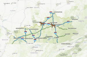
For my first application, I created a map that allows people to view the major Kentucky roadways in relation to the major horse racing tracks in Kentucky. I am from Louisville, KY so this was something I enjoyed a lot. People travel from literally all over the world to go to the Kentucky Derby and since Oaks and Derby are happening today and tomorrow I figured it was fitting enough to investigate. The app allows people to get the basic information about the racing complexes and some basic history surrounding them, as well as the road formations and when they occurred. For some reason, I could not get the link to function so I included a screenshot.
My second application was about worldwide animal studies. I created a survey for people to respond to with their favorite animals and places they are located. I also asked where people would go if they had the opportunity to go study animals in forests/ocean climates and why. I will actually use this survey to help me decide where to go pursue my animal science studies!
Huntington Final
For my final experience I made a webmap of notably bad intersections and interchanges in the greater Boston Area and put it in an experience. Then I made a survey123 form so people could choose which of those intersections was their least favorite which I also put in the experience. Finally I set up a list widget in the experience that would display the results of the survey according to how many times each intersection had been selected. In this way I combined application ideas from multiple chapters into a single GIS experience.