Real-time GIS and spatiotemporal data are used to track and visualize changes over time and space. The types of data this explored are moving data (like moving objects), discrete data (specific events like weather), stationary data (fixed objects with changing aspects), change data (shifts over time). This allows us to look at trends from the past or real time data. A few of the things included in the tutorial were the living atlas, dashboard creation, arcade scripting, data categorization, time series data, and population changes. I found these tutorials interesting and applications could be interesting too. One thing I thought of is that I mobile ordered at starbucks last week and the line was super long so the drink wasn’t ready when it said it was. An application of this could be real time data about how many orders they are working on or how many people are waiting.
Month: December 2024
Norman Week 3
ArcGIS Experience Builder and Mobile GIS are powerful tools for creating and interacting with geospatial content across platforms. Experience Builder enables users to design customizable, mobile-friendly web experiences with drag-and-drop and widgets for 2D and 3D data. It integrates with ArcGIS Online, ArcGIS Enterprise, and the ArcGIS API for JavaScript. Mobile GIS extends GIS capabilities to portable devices like smartphones and tablets, enabling realtime data access, updates, and fieldwork through apps like ArcGIS Field Maps, though smaller screens can limit detail. I thought Chapters 3 and 4 were a little bit more difficult, but also not as interesting as the previous ones. I ran into a few issues, but moved past them fairly easily. There could be several different applications for the features in these chapters because interactive tools like surveys can genuinely be used in any field and make things get mapped more easily.
Roberts Final
App 1: Places to See in Montréal
The first app I made for my final project reflects the topics covered in the Getting to Know Web GIS chapters 1-4. I particularly enjoyed using the Instant Apps program to make a detailed app showing points of interest, such as the one completed in the chapter 1 tutorial. Places to See in Montréal uses the same Instant App format as the one in the tutorial, but with this app I wanted to incorporate points of interest that I saw or visited during a trip with my parents in 2023. To create the app, I first started by making a .csv file with Google sheets; In it, I included the name of the point of interest, a short paragraph to caption the location, and the location’s longitude and latitude. Following this, I then loaded the .csv file into ArcOnline as a Feature Layer, which I opened in Map Viewer to edit basemap, symbology, and visible fields to ones that were cleaner and more cohesive. Once this was complete, I loaded the map into an Instant App preset, and finalized the project. The result is an interactive map displaying 10 pinned locations, each with a caption and 2-3 relevant images attached.
App 2: Hocking Hills Hiking Guide
https://owugis.maps.arcgis.com/apps/dashboards/27e9fc7199cb463f98f874c5f1d7de81
The second app I made for my final project reflects the topics covered in the textbook chapters 5-8. I took inspiration from the chapter 6 dashboard tutorial and made my own dashboard for people interested in hiking in Hocking Hills State Park. The dashboard was designed to provide information for hikers about the status of trails, weather conditions, and other helpful landmarks like parking lots and trail waypoints to ensure a safe and well-planned excursion. I started this project by using the ODNR’s Hocking Hills map for the location of trails and points of interest. After hiding the nonessential information, refining the pop-up details, and changing the symbology, I added the map to a new dashboard. I turned on features such as a search bar and location finder to help hikers navigate to a specific point of the park or their own location. Afterwards, I added in a map of weather advisories from the National Weather Service that automatically refreshes. I finished up the project by adding legends, titles and subtitles, and a theme to make the dashboard clean, legible, and effective.
Kelner Final – Week 8
For my first app I made a survey with survey123 to help locate and collect data to help fill out a life list. A life list is quite literally just a list of birds you have seen in your life so this is kind of a cool way to help collect that data. It is a 4 question survey that collects data for: which bird it is, what the date and time where when observed, where the bird was spotted, and an image of the bird if available.
Application 1: https://arcg.is/KrCDz
For my second app I have a map that updates in real time as the survey is filled out. The survey data is imported and overlayed onto the base map and is indicated by red diamonds to help stand out from the background. While the data is added to the map it is also input into a histogram to help show the most popular time of day that birds are active.
Application 2: https://owugis.maps.arcgis.com/home/item.html?id=4ea82ae450ef4e498090ed57dab06c3f#overview
McNichols Week 8 Final
Application 1 – I created a Survey123 application to facilitate the documentation of invasive spotted lanternflies within Delaware county. The application allows users to provide their location, a picture, a description of the sighting, their name and email address. The default range of the location feature has been set to contain the entirety of Delaware county. It is set to take the location of the device as a starting point. The location, photo, name, email, and date & time fields are all required while the description is not. It caches the name and email fields.
Application 2 – I created a dashboard for the results of my survey. Its definitely properly documenting spotted lanternflies and nothing else. I would have gotten this all done on monday but I couldn’t find the variable names I needed to use to format all the elements of the dashboard.
O’Neill Final
App 1: 3D Storymap on Locations to Visit in Seattle
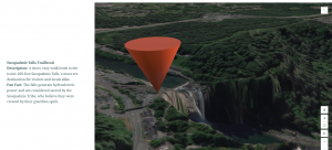
This is a quick storymap showing off some of the best places to tour the city. I researched and found the coordinates for each location in Seattle that I wanted to show off, I compiled them in a spreadsheet and imported it into ArcGIS Online, where I made slides that I put into the storymap you see before you. I decided to use OpenStreetMap as the basemap because I think it was the most aesthetically pleasing 3D representation of the area. I also adjusted the time and made each point have a large 3D Cone icon.
https://arcg.is/0C8vvz0

App 2: ANOTHER 3d Storymap on Locations to Visit, this time surrounding Seattle
I love going on hikes and the nature around the Emerald City is in a league of its own so I decided it warranted its own storymap. I followed a similar process to making my Seattle storymap, but I used an imagery basemap to provide a realistic aerial view of the terrain and chose trailheads around the area as the focal points. I carefully selected some of the best hiking spots that offer breathtaking views, unique ecosystems, and memorable experiences. Additionally, I used the sidecar feature in the ArcGIS Online StoryMap builder, which allowed me to incorporate smooth transitions between each point of interest.
https://arcg.is/1q8nHT

Keckler Final
App 1: Story App
https://storymaps.arcgis.com/stories/55108ead79bc42979a28e6dfd510a0b9
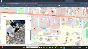
For my first application, I collected the locations of cats around the campus and immediate area- as well as some other cats that I wanted to showcase not limited to this area- in order to create a map. Clicking on the points provides brief descriptions of each cat including if they are outdoors, can be pet, and a picture or two of them. From that point, I created a story app, called “Delaware Cats: and other notable felines,” where users can interact with my map and learn a bit about the risks of allowing pet cats to freely roam outdoors such as contracting diseases, fighting, cars, etc. I also provided a video where users can learn about spaying and neutering cats since feral cat colonies are an issue in many areas- including Delaware- and spaying and neutering improves the animal’s quality of life. Then, I concluded with a couple of image galleries of my cats alongside a very old picture of me and my old cat Snoopy.

App 2: Instant App
https://owugis.maps.arcgis.com/apps/instant/3dviewer/index.html?appid=ac103aa3dd7b42af91bd020ab6386692
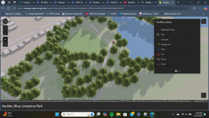
For my second application, I created an Instant App of my 3D Web Scene of the Blue Limestone Park. I added trees, cars, swings, benches, a table, and other playground structures using the fun park layer from the seventh chapter. Unfortunately, the models would not cooperate with me enough to rotate, so everything is facing the same direction. In addition to that, the sizes of the trees are misleading- many appear much larger on the map than they do in reality. Regardless, this scene can be used to gather an idea of what the park is like and the amenities that it has to offer visitors.

Johnson- Week 8; Final!
https://arcg.is/1ureGD0
For my first application, I decided to make an interactive survey that relies in the hands of students to report where Ginkgo trees are on campus! Since coming to Ohio Wesleyan, I’ve noticed that every year, new students will question what the horrific aroma around campus is and to their surprise, it is the fruit that Ginkgo trees drop. I thought it would be cool to have the entire campus be aware of the trees and locations of where they are so they could possibly avoid them on their routes to classes. Along with this, being aware of not to step on the fruit that has been described as a mix of rotting flesh and vomit.
https://arcg.is/0OjOai
For my second application, I decided to do another survey to track the activity of students on campus in an attempt to publish activity in different buildings. One of the worst things is when trying to find a space to study, there are already a lot of occupants there that can make studying difficult. Along with that, walking from Smith dining hall to the science center only to find study areas packed can be really annoying and a waste of time and energy. I made another survey that once information is tracked, can be placed on a map, similar to restaurants or fitness areas that let people know ahead of schedule the estimated wait time.
Dodds final
I developed two integrated applications designed to tackle the issue of litter in a collaborative and data driven way. The first application is a user friendly survey tool that enables individuals to document various types of trash they encounter. This app collects detailed information, including photos, descriptions, and the precise geographical location of each item of litter. The data gathered is not only comprehensive but also easily accessible, allowing for a wide range of users to contribute effortlessly.
The second application builds on the data collected by the survey app and translates it into actionable insights through a heat density map. This map visually highlights the most littered areas, emphasizing their proximity to bodies of water. By combining user input with geographic information systems, the app provides a clear visual representation of litter hotspots, making it easier for organizations and communities to prioritize cleanup efforts and implement targeted interventions
Kelner Week 4 + 5
Week 4:
Chapter 6 delves into real-time GIS and spatiotemporal data, which enable tracking and visualization of movement, changes, and stability over time and space. Key data types include: Moving data – which tracks objects or events in motion like traffic or wildlife; Discrete data – for specific, semi-random occurrences such as accidents or weather; Stationary data – for fixed objects with changing properties like population density; and change data, illustrating growth or shifts, such as urban development or invasive species spread. These tools allow users to focus on specific moments or trends over time, offering flexibility to display many or few events and analyze their temporal dynamics.
Application: By using moving data we could look at program that would be able to track migratory birds. An application like this could help find specific fly ways a species uses.
Week 5:
Chapter 7 looks at 3D GIS. It offers additional dimensions over 2D, making it a powerful tool for applications such as urban planning, storytelling, and architectural design. It enhances understanding of object size, position, and relationships. Photorealistic 3D scenes recreate reality with photo-textured features, while cartographic scenes adapt 2D mapping techniques—using height, size, color, and transparency—to represent abstract data like population density or earthquake magnitude. 3D scenes consist of surfaces (foundations), operational layers (features anchored above or below surfaces), textures (interior and exterior covers), and atmospheric effects like lighting and fog. ArcGIS supports 3D mapping through tools like Scene Viewer, ArcGIS Pro, and CityEngine, which create web scenes grouped into photorealistic and cartographic layers. 3D scene layers include building models, integrated meshes (stitched from drone footage), point clouds (large datasets from lidar), point scene layers (optimized for speed), and voxel layers (volumetric data for atmospheric or oceanic studies). Advanced 3D forms—extended reality (XR), virtual reality (VR), augmented reality (AR), and mixed reality (MR)—make GIS more immersive and interactive, while ArcGIS Urban integrates 3D mapping with planning tools to manage and visualize urban projects effectively.
Application: Making an app that looks at nesting sites of peregrine falcons on top of buildings and bridges would be kinda cool to help show nearby food sources and protection from weather.