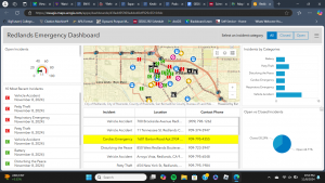
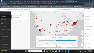
Chapter six was a welcome change from last week. It was more within my level of understanding and comfort compared to working with 3D maps and mobile apps. There were a couple things that tripped me up, such as the coding. Initially, I had made a mistake with my coding because I was having trouble understanding the directions in the tutorial. Luckily, the changes that the codes made were immediate, so I could act accordingly once something did not appear or appeared incorrectly. Though, the heart icon would not work at all, so I proceeded despite that hiccup. I do wonder about how the emergency information is input and updated so frequently. Do dispatchers input the information, and it is input into GIS in tandem? Or is there another process? While putting together the animation for the population change, everything went as it should. The final animation was a bit anticlimactic, though. The slider moved itself and showed how populations moved west into the states and so forth. I am not quite sure what I expected, but the slider did precisely what it was supposed to. It showed the change in population within the US over the past two hundred years over a few seconds.


An application idea that I have from chapter six could be to use the Delaware Data to show how parcel plots in the county- or maybe just the city- have changed over the past ten or twenty years since the county has been growing so much. Another idea that I have could be to document all of the places I go to throughout a regular day- perhaps a week- and make a time slider of that to see where I go to and how much time I spend in each place throughout the day.