Norman Week 2

The first chapter discusses applications of Web GIS in different fields and how its use is increasingly valuable in different scientific fields, businesses, governments, etc. People also use these types of applications in everyday life. Having this software on the Web makes data and different features more accessible. The tutorials were fairly easy and showed how to upload data, add fields, and add feature layers.

The second chapter has six tutorials and goes more in depth looking at feature layers and different ways that you can format maps to best display your data. These tutorials were definitely more challenging than the first chapter, but I didnā€™t have too much trouble with it. I think the software is very cool and I love the incorporation of all the different base maps and data.

I think I would like to do something with economic data since I am a politics and economics major. I think looking at employment data could be interesting.
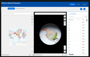
McNichols Week 4

Not too much to report, everything went smoothly. At one point I had to turn off my adblock for the timeline QuickApp which I thought was interesting. I think these programs could be used to chart the growth of invasive species populations like the Spotted Lanternfly as an assignment, though I’m not sure how readily available that data is to the general public.

McNichols Week 3

I’ve run into the same issue with Dynamic Content in 3.3 that Haley described but can’t find a fix for it. The ESRI community post I’ve found didn’t help as I’ve already formatted it the way they’re recommending with no success. 11/08 I’m back, it was just hidden behind all the open panels and zooming out fixed it. The editor missed a https on a link in 3.6. Everything else went fine. I think in terms of the experience builder assignment I’m thinking about the work I did with the Ohio EPA: as a stormwater program intern I conducted inspections of construction sites and had to reach a certain quota of large and small sites for the agency. I think it would be interesting to document a chronology of those site visits and filling those quotas.

There isn’t an “Imagery Hybrid” option, I’m guessing it’s “Imagery with Labels?” There’s been a couple other issues that came up but I figured it out with 4.1 and 4.2. Visual and UI updates keep slowing me down. There’s not a Community Map option in 4.4, my keyboard is freaking out so I’m gonna return later. Based on other people’s work I’m just going to choose the imagery with labels. I wish there weren’t so many non-functional changes to this program that make the older versions of the textbook harder to follow. There’s just a lot of small things, like in 4.6 when I clicked on the name it opened up a little pop-up to the side of the page that did not have the visualization tab to select from. Everything else went fine.


Roberts Week 5

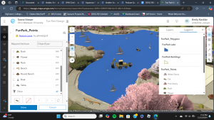
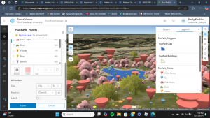
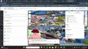
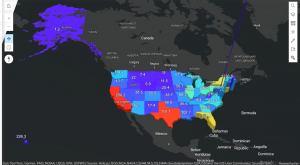
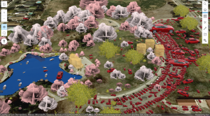
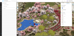
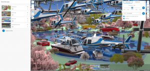
Chapter 7:Ā The textbook explanation of the difference between XR, AR, MR, and VR seems like it could be increasingly more relevant in today’s modern world (I previously was not aware that the terms XR and MR even existed). Also, the fact that an ArcGIS program was used to build cities in several movies is not something that I expected to read, but it makes sense given the abilities of the program. The state population density map visual turned out really neat, but I could not figure out how to resolve the issue with Alaska’s mountains sticking out through the polygon extrusion (I could not locate the elevation mode setting that the book said to use to fix the problem). While the 3D features might have some advantages, I definitely had issues with this specific Fun Park scene. Some of the feature placements and counts just seemed strange- the parking lot was a solid sea of cars (with some the size of buildings and others the size of chickens), I could not locate any helicopters, and there were giant cars in the lake and picnic tables in the middle of the road. The final link was not any better and included a sky overwhelmingly full of helicopters in addition to the hundreds of Teslas. Overall, the provided scene was messy and inaccurate, but the features of the 3D scene viewer could make a great visual if used properly.

Assignment: I think it would be really cool to use this program to plan out a park on an empty plot of land. The possible 3D marker shapes make this entirely plausible and the ability to realistically scale objects to size would make it an excellent planning tool. For example, I could take an empty spot on campus and plan a small garden/path/seating area using the ArcOnline tools. I could also use the program to mark already existing features like we did in the tutorial, which I could apply to a section of campus like the area in front of Slocum.

Johnson Week 5

While chapter 7 was really interesting and fun to get into, it was definitely really overwhelming as it almost felt like there was an entirely new version of the programming to learn. When I first started, I saw that there had in fact been an update, but during the tutorial, it was a bit difficult to find different things that had been mentioned. Beyond that though, the different additions that can be added to maps like bushes, trees, cars, bodies of water that almost have their own animation style, and so many other things was really cool to see! In this 3D version of the GIS program, previous content learned can be applied to an even further and more realistic way. There are different forms, such as VR, or virtual reality that can be more accessible, convenient and in some instances, reliable for users when this augmentation is applied.Ā 

Application Idea: Seeing how much I was able to do after reading chapter 7, I think it would be a cool idea to map where all the Ginkgo Trees are on campus as when they begin dropping the putrid smelling fruit during the colder months of the academic year, a lot of students become nauseated at the smell. I thought that it would be cool to jot down the areas where the trees are, both on academic and residential sides of campus so students could be more aware of where to watch their step to avoid stepping on the smelly fruits, as well as being aware of what areas might be the stinkiest depending on how populated the density of the female Ginkgo trees are in that area! This map could have a simple outline of the academic buildings, different walkways, benches, parking lots, and possibly even some of the statues and boulders we have around campus!


Keckler Week 5

When I got onto ArcGIS, I was notified of a new update- how exciting! Chapter 7 was by far the most fun chapter to interact with. I greatly preferred working with 3D in this chapter compared to in the previous chapters. Apparently, you can even make clouds in GIS- which sounds like a fun detail to include when looking at architecture in an area with frequent rain and overcast. Throughout the tutorials, I found myself enjoying trying out different object symbols within the Fun Park. There were cars- represented as backhoes in my scene- in the lake and other peculiar places; this was also the case with the boats. That was a very weird detail. I could not locate ā€œElevation Modeā€ while I was completing the tutorial, so I just went on without it. It is a nice feature that the Fun Park scene used for the latter two tutorials can be updated by anyone, but the scene became very messy. My laptopā€™s performance dropped so significantly from all of the objects, and error messages were popping up about the scene’s server. I also could not locate the tools within the Analysis section for the final section of the Tutorial. Once I reached that point, I ended the chapter.Ā 

A final project idea that I have could be to map trees, benches, plants, etc. around the residential or academic sides of campus to create a 3D web scene. Another potential idea would be to map out the locations of public benches and other amenities at the Blue Limestone Park just a short walk from Sanborn. Seeing where benches and other amenities are- or are not- can be insightful as to accommodations that the city makes to be accessible to people who may feel the need to sit or activities that are available at this park.

McNichols Week 5

The additional dimensions that 3D GIS offers over 2D serves as a better vehicle for a lot of different applications like urban planning or defense simulation. It helps people understand size and relative position of objects. Photorealistic 3D scenes use photos to texture features, while Cartographic scenes take the mapping techniques of 2D and applies them to 3D using height, size, color and transparency to display features like population density or earthquake magnitude that aren’t viewable from a 3D representation on its own. 3D scenes are composed of surfaces that provide a foundation for other content, features that are anchored above or below the surfaces (these are the operational layers), textures that provide the exterior or interior covers of the 3D features (often with aerial imagery or cartographic symbols), and finally atmospheric effects like lighting and fog. 3D scene layers can be used to present simple representations of buildings (textured or untextured), more complex digital models of buildings that let you interact with its components and look at its specific properties, category layers (windows, walls, etc), or filters that let you select elements with specific attributes. Integrated mesh scene layers construct complex images just from stitching together drone footage by matching angles from different data points together into a single synthesized projection. Point cloud scene layers quickly display large amounts of symbolized point cloud data, usually collected via lidar (This one looks like a heat map). Point scene layers thin out the dataset from point clouds to increase visualization speed and visibility. Voxel layers create a volumetric vizualization, often used for atmospheric or oceanic data.

There’s not an Elevation mode to select in 7.2 so Alaska’s gonna stay a little funky.

I’m really curious why some of those cars are such different sizes when so many others are at-scale.

Assignment idea: I think it’d be interesting to make a 3d web scene of one of the parks we run at for cross country.

Godsey Week 5

Chapter 7: 3D Web ScenesĀ 

The 3D world has four advanced forms: extended reality (XR), virtual reality (VR), augmented reality (AR), and mixed reality (MR) ā€“ all of these make GIS more immersive and helpful to users. In ArcGIS, 3D web maps are named web scenes or 3D scenes, giving users several advantages over 2D maps, such as storytelling, urban planning, architectural design, and filmmaking. Web scenes can contain multiple layers grouped into photorealistic and cartographic categories. Photorealistic layers aim to re-create reality through photos and texture layers. Cartographic layers use attribute symbols to display physical, abstract, or invisible features (population density, flight paths, zoning laws, etc.). Scenes have four main types of elements, surfaces, features, textures, and atmospheric effects, and include the following types: 3D object scene layers, building scene layers (overviews, disciplines, category layers, and filters), integrated mesh scene layers, point cloud scene layers, point scene layers, and voxel scene layers. Scene Viewer, ArcGIS Pro, and CityEngine are primarily used to create web scenes that, once published, can be viewed in commercial-off-the-shelf client apps and custom client apps developed through ArcGIS API. ArcGIS Urban allows users to integrate 3D mapping with urban planning and BIM to create, manage, edit, and display plans, projects, indicators, and ideas.Ā 

Application Idea: Create a 3D web scene of OWUā€™s campus, specifically on the Jay.

Keckler Week 4

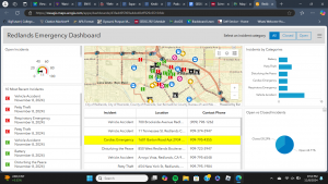
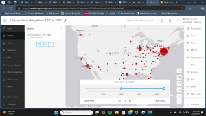
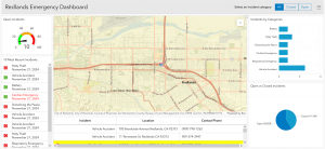
Chapter six was a welcome change from last week. It was more within my level of understanding and comfort compared to working with 3D maps and mobile apps. There were a couple things that tripped me up, such as the coding. Initially, I had made a mistake with my coding because I was having trouble understanding the directions in the tutorial. Luckily, the changes that the codes made were immediate, so I could act accordingly once something did not appear or appeared incorrectly. Though, the heart icon would not work at all, so I proceeded despite that hiccup. I do wonder about how the emergency information is input and updated so frequently. Do dispatchers input the information, and it is input into GIS in tandem? Or is there another process? While putting together the animation for the population change, everything went as it should. The final animation was a bit anticlimactic, though. The slider moved itself and showed how populations moved west into the states and so forth. I am not quite sure what I expected, but the slider did precisely what it was supposed to. It showed the change in population within the US over the past two hundred years over a few seconds.

An application idea that I have from chapter six could be to use the Delaware Data to show how parcel plots in the county- or maybe just the city- have changed over the past ten or twenty years since the county has been growing so much. Another idea that I have could be to document all of the places I go to throughout a regular day- perhaps a week- and make a time slider of that to see where I go to and how much time I spend in each place throughout the day.

Veerjee Week 3

Chapter 3: Experience Builder

This is mostly for a more complicated way to create apps, maps, and more. Things an experience builder could include: components such as pages, windows, and outline views. It could also include various widgets such as functional & layout widgets. Widgets are classified into two groups, message actions & data actions. When using a message action, it listens to various triggers and performs assigned actions. For data actions, they provide actions to a button that users are able to click on, a usage could be to export records to a file.Ā 

  • Tutorial 1: Creating a basic webpage that included 2 different maps, an image, and methods of switching between the two of them through a view selector.Ā 
  • Tutorial 2:This was more about how to create various actions for the data, in this case it was the action of making sure the the maps of 2d & 3d match, and with selections when the 2d points are selected, only those ones will appear on the 3d map. These are done by utilizing the action tab that appears once map tabs are selected under the outline window.
  • Tutorial 3: This was mostly about how to add a text box that included statistics. It is fairly similar to things we have done in ArcGIS pro, except as a presentation-like format. From this point forward, I have realized I am messing up the styles/formats of the web experience, however I am going to just add the features & try to salvage it as best as I can.
  • Tutorial 4: This tutorial was about how to create a table & how to make it so it displays certain fields in a specific order. Also adding a search bar & filters for the data.
  • Tutorial 5: When adding a filter I will want to use an SQL expression to ensure that the map itself flows. I can choose various criteria that I want my maps to be filtered by. I got pretty lost halfway through, but from what I am able to judge, I am also able to make filters for the table that I had added in the previous tutorialĀ  & also be able to make a donut chart. And when going through the actions, I am able to trigger something to spawn a chart for various data that I give said chart.Ā 
  • Tutorial 6: This felt like it brought everything that we have made together, and I believe I misunderstood some instructions referring to the cosmetic effects of the main page. This tab was about making a header & more pages with the ability to swap between them.

Chapter 4: Mobile GIS

There are many reasons why Mobile GIS is useful, such as mobility, locational awareness, ease of data collection, real-time info, large user volume, and many ways to communicate. GIS is useful in a bunch of different technologies. I will want to be careful in concern to the utilization of the web interface as phones are needing more simplistic designs. There are three main schools of thought when it comes to app development strategies:Ā 

  1. Browser based – which is using apps through mobile web browsers. This will be fairly limiting the userā€™s experience as it will not be utilizing the phoneā€™s features.
  2. Native-based approach – which will be using a mole app, a disadvantage for that would be learning skills for the coding languagesĀ 
  3. Hybrid-Based approach – A combination of both native & browser based approaches
  • Tutorial 1: To get to the ā€˜set ruleā€™ option, go into edit, then find ā€˜behaviorā€™. And instead of ā€˜If showā€™, go to the thing you want to see, and then select the conditional. This is very similar to a software such as Google Forms
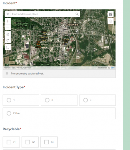
  • Tutorial 2: I thought it was fairly cool that I could use Survey123 to submit data from my phone. It seems fairly intuitive to collect data & be able to check them out using the page.
  • Tutorial 3: I had gotten very lost early on in this section. I think it is because I screwed something up within the tutorial section for the surveys. However from what i can gather, thiss will be tying the survey itself to sync with a feature layer by going into where the survey is collecting responses. I can add a new field for the various different types of data being collected and make them appear as points on the map. And they will appear as lines within the map.Ā 
  • Tutorial 4: Same issue as tutorial three, but here is what I was able to gather from the tutorial, this will be adding some form of visibility layer with conditional statements. This will be done by adding another layer, and adding various expressions to make it ā€œIncident_Type == Potholeā€, for example. And this will allow a user to filter the different types of data within the map.Ā 
  • Tutorial 5: It appears that in this tutorial I am able to use another app in order to compile data to put directly into my field map rather than filling out a form to put into the map by using skills from tutorial 4.
  • Tutorial 6: In tutorial 6 we are using the map created in tutorial 3,Ā  this will be using the quick capture software to do. And this will be a great way to include a user-friendly app interface that includes icons for each type of thing you want input on.Ā 
  • Tutorial 7: This is just showing how to utilize what was made in Tutorial 6.
  • Tutorial 8:Ā  Utilizing AR will be a way to add more context for the things made in the previous sections.Ā 
  • Tutorial 9: Utilizing AR will be a way to add more context for the things made in the previous sections.


Application description based on Ch 3 & 4 using my data:

  • Create a web experience. (Ch 3)
  • Creating a survey form for a department to report suspicious activities will be a really good use for GIS tech, maybe creating something for Public Safety? (Ch 4)