
For the final part of this series on Bronze Age comics (1970-1985), I wanted to discuss the beauty of art from this time period. I am not a professional in the study of art, nor am I an art critic, and I do not intend to pretend that I am. Nevertheless, I wanted to take some time to appreciate the vintage comic book art aesthetic, particularly of the 1970s and 1980s.
I must admit that a nice-looking cover is what will make me buy a comic. Surely, comic book artists know the importance of the cover art, as the most dramatic, climatic event of that individual story is portrayed on the cover with vibrant colors to grab the attention of a potential reader. Most comic books are cheap short stories that take about five to ten minutes to read, and the pictures are emphasized more than the text. So, you will never find me flipping through any comic to get a sense of what it will be about as this is not really necessary…and it ruins the fun!
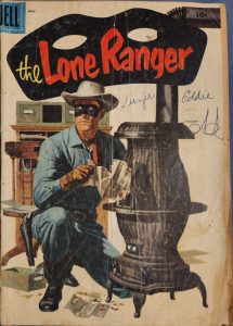
“The Lone Ranger: The Kid.” The Lone Ranger. Dell Comics. 1956.
I further concede that I do love the art style of some comics from the Golden Age of comics (1930s-1950s), such as Lone Ranger, Tarzan, etc. Cover art of comics from this time feature hand painted realistic images of the main characters of the story. This particular style brings the characters closer to life, as we can see them more as an image of a real person, rather than a cartoon character. When reading comic books, you likely want the protagonist to be real, you want to believe this to be true but you know that it is just fantastical fiction. The desire to believe that these amazing heroes are real, and the art striving to make those heroes look real are part of the beauty of this vintage art style. However, as you turn the page to read those Golden Age comics, you’ll notice that the illustrations get more cartoonish but still very detailed.
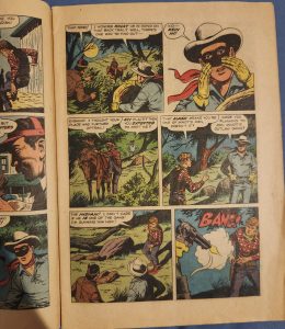
“The Lone Ranger: The Kid.”
Returning back to Bronze Age comic book art, you may notice that a lot of the images in vintage comics strips, even during this time, were composed of small dots. This is because of a printing process referred to as the halftone process, in which photomechanical plates used halftone screens to aid in the process of transferring images onto the metal printing plates which were made from molds. This process created small dots of different sizes that would blend in the viewer’s eye to create gray tones. This use of a grid of small dots was a cost-effective way of creating an illusion of more colors and shades other than the four colors they used which were: cyan, magenta, yellow and black (Retro Supply Co. “Comic History: Color and Print”).
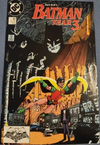
Wolfman, Marv. “Batman Year 3: Changes Made.” Batman Year 3 Part 2 of 4. DC Comics. 1989.
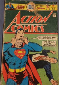
Bates, Cary. “Superman’s Fantastic Face-Saving Feat!” Action Comics. DC Comics. 1975.
Bronze Age comic books utilizes lines for shadow and contour of figures or structures on the page. Characters and their gestures are not extremely exaggerated, nor as clean and polished as Modern Age comic art appears, at least to me which I prefer. I enjoy the hand drawn and sometimes flawed appearance of vintage comic book art. These flaws could be the bleeding of ink perhaps from ink bubbles, or an appearance of distorted or copied images which is a printing error. An instance of this distortion is shown in an image below from an issue of Action Comics, featuring Superman. In the image on the center right side of the page where Superman is flying upwards above a hot air balloon, you may see a distortion of Superman’s head in which there appears to be multiple images that have been printed over each other giving his form a kind of vibrating effect. This is not that big of an issue at all but nevertheless, it is still intriguing to see.
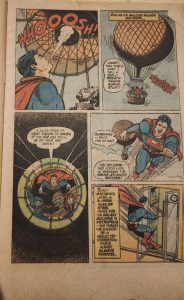
Bates, Cary. “Superman’s Fantastic Face-Saving Feat!” Action Comics. DC Comics. 1975.
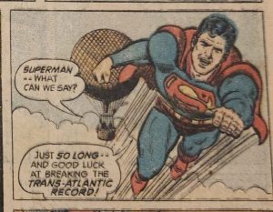
Bates, Cary. “Superman’s Fantastic Face-Saving Feat!” Action Comics. DC Comics. 1975.
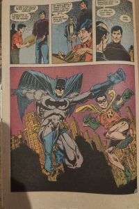
Wolfman, Marv. “Batman Year 3 Chapter Four: Resolutions” Batman Year 3. DC Comics. 1989.
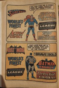
Some more things that I enjoy about this art are how the comic artists make their advertisements a part of the comic in a way, and make them humorous, absurd, and wacky unlike many ads today. Additionally, the pictures on the pages of comic books are arranged like a storyboard for a film. The different angles of a picture, and the composition of the subjects in the picture utilize balance, symmetry, and even depth in many of their images. In the issue of Batman Year 3 Part 4 of 4 shown above, you can see how the placement of Batman and Robin appear fairly balanced within each box. And in the ad below that is also featured within the comic, the heroes are in the center of the page while comic brand names are aligned on their left and their right evenly, creating a satisfying, colorful, vibrant, and fun aesthetic for just being an advertisement.
“Batman Year 3 Chapter Four: Resolutions.”
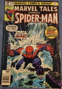
Wein, Len. “Skirmish Beneath the Streets!” Marvel Tales Starring Spiderman. Marvel Comics. 1981.
To wrap things up, there is nothing mystical about this time period, nor is there anything necessarily wrong about the other time periods of comic books but I find myself reading mostly Bronze Age comics. I go through frequent phases of immersing myself in older things, as plenty of other people still do today. Older things, whether that be comics, literature, music, movies—basically, all of the above—are comforting and something more tangible to me than many newer forms of entertainment. Now that you’ve seen all there is to love about Bronze Age comic books, I encourage you to stop by your local bookstore or comic book store and see if any comics appeal to you. Since you’ve made it this far in the series, go ahead and give vintage comics a try if you have not already, and see how your favorite heroes and crimefighters used to be portrayed and what they were fighting for.